The problem
A ceremony booklet is made of landscape sheets, printed on both sides, folded in half and stapled in the middle. The hard part is imposition: each sheet carries four pages that aren't consecutive. For an 8-page booklet, the front of the first sheet holds pages 8 and 1, its back pages 2 and 7. Word and Google Docs don't handle this naturally, so people reorder pages by hand, print, fold, realise it's wrong, and start again. Usually the night before the ceremony.
I ran into this problem first-hand, which is where the project came from. The goal set from the start was simple to state: 100% of booklets, from 4 to 48 pages, in A4 or A5, must print in the right order on the first try.
What Karnet does
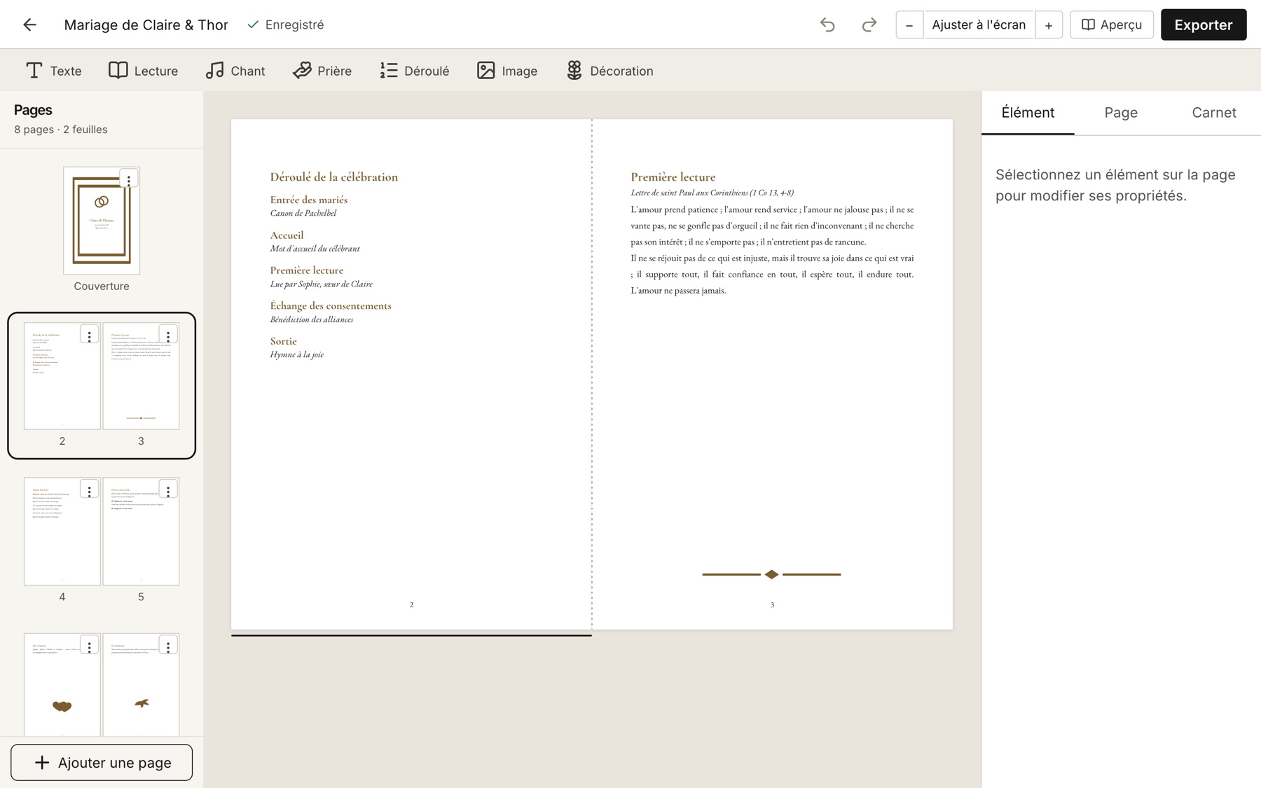
- A spread editor: free placement of text, images and decorations, alignment guides and snapping, rotation, stacking order, undo/redo
- Ceremony blocks: a reading with its reference, a song with verses and refrain, a prayer with responses, an order of service
- Themes: 4 predefined themes, 8 open-licence font families, per-element style overrides, and a format change (A4, A5, custom) that scales everything proportionally
- Images and decorations: drag and drop, cropping, iPhone HEIC photos converted, metadata stripped, and a library of 24 recolourable vector motifs
- Export: an imposed PDF for double-sided printing with a printing guide, a reading-order PDF to send by email, and a flip-through preview
- Saving: automatic saving in the browser, and a .carnet file to keep a copy or move to another computer
No server, on purpose
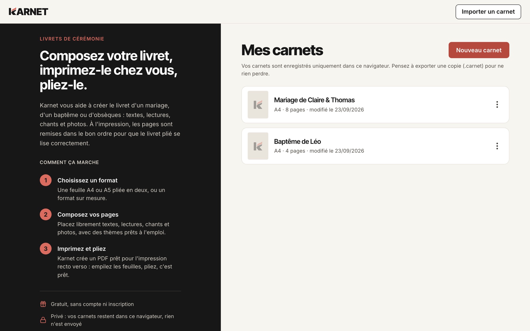
A ceremony booklet holds personal things: names, family photos, sometimes a eulogy. So I set a hard constraint right from the architecture: no content ever leaves the device. No account, no API, no remote database. The server does exactly one thing: serve static files.
And that's not just a promise on a privacy page. The Content Security Policy forbids the browser from connecting to any domain other than the app's own: even a bug or a malicious dependency couldn't send a booklet elsewhere. Everything else follows from that: booklets live in IndexedDB, a lock prevents editing the same booklet in two tabs, and the app asks the browser for persistent storage so it isn't wiped by the first automatic cleanup.
The flip side is that the browser becomes the only storage. Hence the .carnet file (a versioned archive holding the document and its images), a backup reminder when you've done a lot of work without exporting, and clear banners when storage runs low. Import is treated as hostile input: the tests cover corrupted files, an archive trying to escape its folder, and a zip bomb.
A bonus of this architecture: Karnet is a PWA. After the first visit, the app works fully offline, which is handy for a last-minute tweak on the train.
The real challenge: the same text everywhere
The most structuring constraint wasn't imposition (that's a pure function, tested exhaustively), it was text. If a line breaks at one spot in the editor and at another in the PDF, a paragraph can overflow its box on paper without anything flagging it on screen. And every browser lays out text slightly differently.
The chosen approach is hybrid. For typing, a regular rich-text editor (Tiptap), because rewriting the caret, selection and accented input is a bottomless pit. For everything else, an in-house layout engine: it measures each glyph from the bundled font files, computes line breaks following the Unicode rules, and outputs the exact position of every word in millimetres. The on-screen rendering (in SVG), the thumbnails, the preview and both PDFs all consume that same result.
- Document Styles theme → element → paragraph
- Engine Measure glyphs from bundled fonts
- Engine Layout every word placed in mm
- Screen SVG editor, thumbnails, preview
- Worker PDF imposed or reading order
Two rules make this reliable. Every word is placed explicitly, on screen and in the PDF alike, so a glyph rendering difference can never move a line break. And kerning and ligatures are disabled everywhere at once, because a single one of the three (CSS, engine, PDF) applying them would shift everything.
To check it, I built a “PDF truth harness”: an end-to-end test exports the same booklet from Chromium, Firefox and WebKit, extracts a structural fingerprint of each PDF (page count, sizes, position of every word), then compares all three. Result: exact parity. It's backed by a manual protocol, because nothing beats a real folded sheet: 4, 8, 12, 24 and 48 pages, in A4 and A5, on two duplex printers.
The ghost letters bug
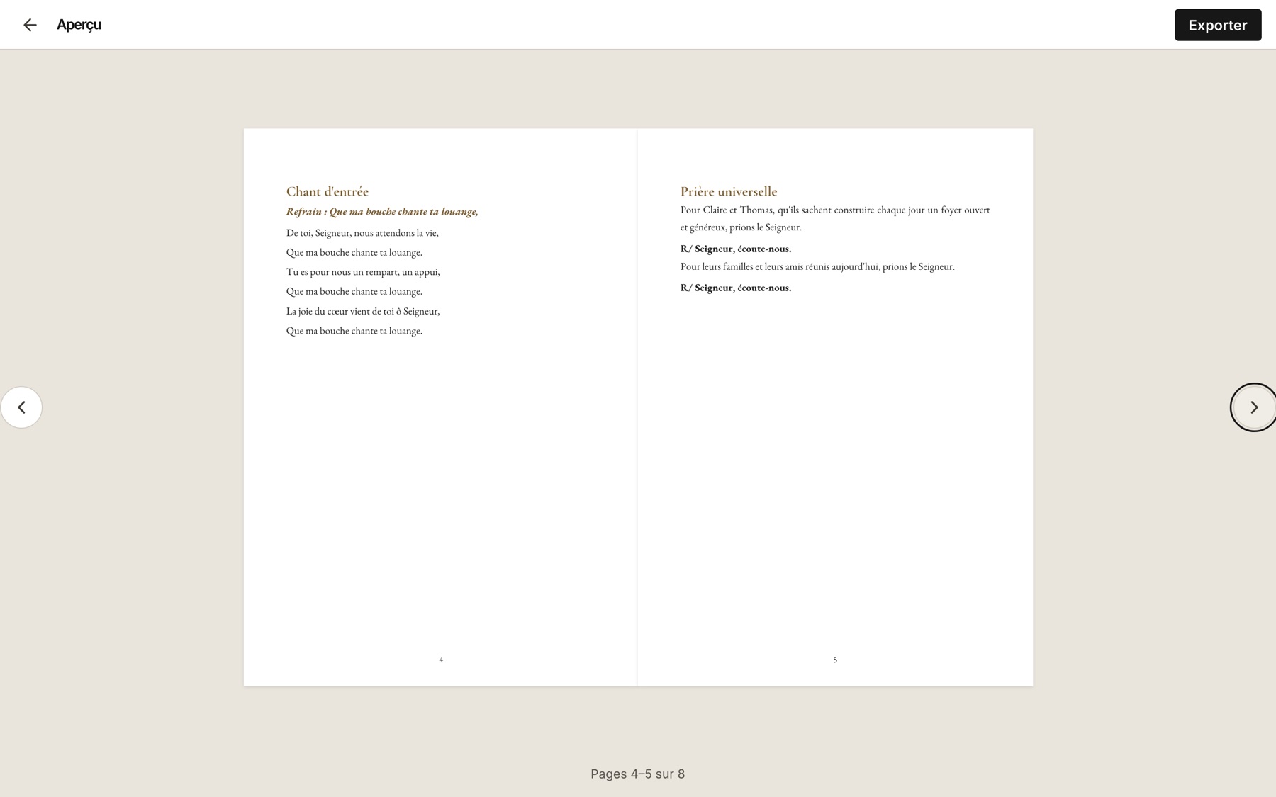
My favourite bug of the project showed up at the very end. Every test passed, the PDF fingerprints matched across browsers… and yet, when opening some exports, letters showed up blank or garbled. Word placement was perfect; it was the drawing of the glyphs themselves that was broken.
To keep PDFs small, only the letters actually used are embedded: each font is subset. The problem was the format of the glyph index table in those subsets. In its “short” version, a TrueType font stores offsets divided by two, which assumes every glyph starts at an even address. The subsetting library didn't guarantee that alignment: an odd offset got truncated, and the letter pointed one byte away from its real data. The fix: align every glyph when building the subset. The lesson: my harness checked where the words were, not what they looked like. The test added afterwards checks the font data too.
Planned first, then built in parallel
As with my previous projects, I started with planning using the BMAD method, but this time on the full track: a product brief, a PRD with functional and non-functional requirements, a 20-ADR architecture, two UX documents (visual system and user journeys), then 52 stories across 8 epics, with 311 acceptance criteria in total.
Each story is a self-contained contract: its acceptance criteria, technical notes citing the source documents, a testing strategy, and above all the exact list of files it's allowed to touch. That last point is what made parallel development possible. The stories were scheduled into 14 waves, each containing only stories with disjoint scopes, then implemented by Claude Code agents each working on its own story. The code is split into layers (pure TypeScript domain at the bottom, screens at the top), and a linter forbids imports going upward: the architecture isn't just documented, it's checked on every commit.
Eleven days separate the first commit from going live. What made the difference wasn't how fast code got generated, it was that every decision had been made beforehand: when an agent wondered how to measure text, the answer was already written in an ADR, with an explicit ban on using the DOM. And when a decision changed along the way (the rename to Karnet with its new visual identity, a new home screen), it went into a decision log rather than being silently rewritten.
Stack & hosting
- React 19, strict TypeScript, Vite: a modular monolith SPA, no backend
- Zustand + Immer: every change goes through a command, which gives a patch-based undo history
- Tiptap for typing, fontkit and an in-house engine for layout
- pdf-lib in a Web Worker to generate PDFs client-side
- Dexie (IndexedDB) for local storage, Zod to validate every loaded or imported document
- Vitest and Playwright: nearly 200 unit test files and 37 end-to-end scenarios, run on Chromium, Firefox and WebKit
- Caddy in Docker, behind Traefik on my OVH server, with the security and caching headers set by the architecture
What I take away from it
- A strong constraint in the right place simplifies everything else. “No content leaves the device” removed accounts, the database, GDPR paperwork and half the attack surface in one go.
- WYSIWYG isn't free once you leave the browser. Guaranteeing that the screen and the paper match meant taking back control of text layout.
- To get several agents working at once, the key isn't the tool, it's the breakdown: disjoint file scopes and decisions written down in advance.
- A test only checks what it measures. Perfectly identical PDFs can still be wrong.
What's next
The editor needs a screen of at least 1280 px: the home screen and dialogs adapt to mobile, but composing a booklet on a phone was out of scope. Next ideas: touch editing on tablets, automatic hyphenation to fill justified pages better, and complete booklet templates ready to customise.
Try Karnet
The app is live, free and needs no sign-up. The code is private, but I'm happy to talk about the architecture or the technical choices.